College Logo
The Pasco-Hernando State College logo is the primary graphic identity for the institution. As the emblem for the entire PHSC community, great care should be given to correctly use the master logo. Our logo is one of our most important assets. Consistent treatment is key to creating a clear understanding of who we are and what we stand for.
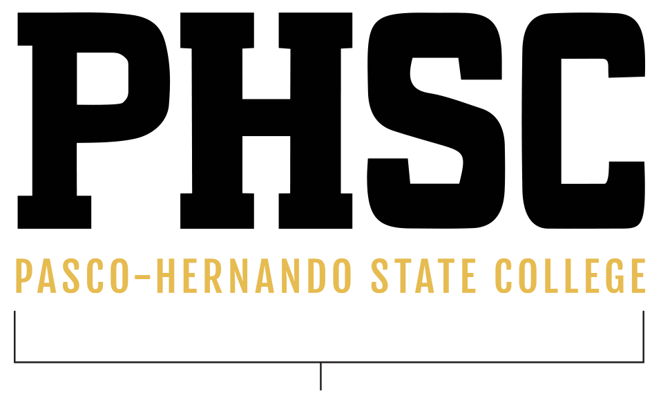
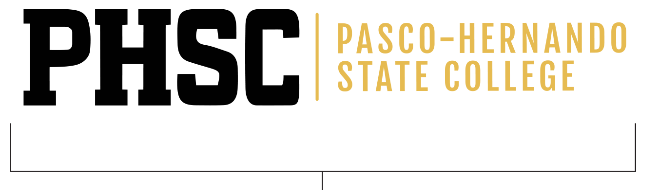
It is a combination of the monogram and the College’s name or “signature” in two colors, in a fixed relationship that should not be altered or modified. The PHSC logo should appear in black and gold whenever possible only in the configurations presented here.
All departments/offices within the college, except for Athletics, Student Experience and Engagement, and the PHSC Foundation must use the official PHSC Master logo. Department logos are created in special circumstances with the approval of the Senior Director of Marketing and Communications and have limited use.
The logo must be on the front cover of all printed materials created for external (student and community) audiences. For internal (employee) audiences, the logo can be placed either on the front or back cover. For all official documents, logos must be at top left of page.
Clear Space
Clear space isolates the logo from competing elements—such as text and graphics. This preserves the integrity of the logo and ensures legibility prominence.
Always maintain the minimum clear space around the logo. The minimum clear space is based on a height of 0.5’’ on all four sides of the logo.
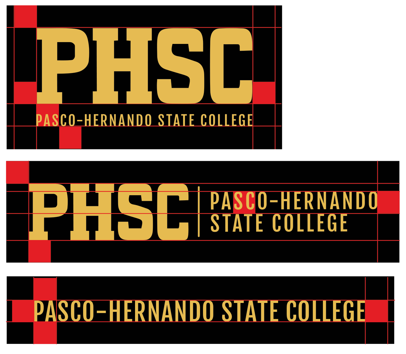
Stacked
Determined from the bottom of the PHSC text to the bottom of the Pasco-Hernando text. All four sides at the minimum.
Horizontal
Determined From the height of the wording Pasco-Hernando to the top of the wording State College. All four sides at the minimum.
Horizontal Straight Text
Determined by the height of the text itself. All four sides at the minimum.
Approved Alternate Logos
In applications in which the preferred logo treatment does not present well, use an approved alternate logo. The approved clear space is 0.5” around all PHSC logos.
Scaling
The PHSC logo is a strong mark that can be scaled proportionally to a wide range of sizes. However, a logo that is too small, will be illegible and ineffective. The minimum size of a logo varies and depends on the version used. When scaled proportionally, the smallest sizes for the approved logos are as follows:

Master Logo—Improper Logo Treatments
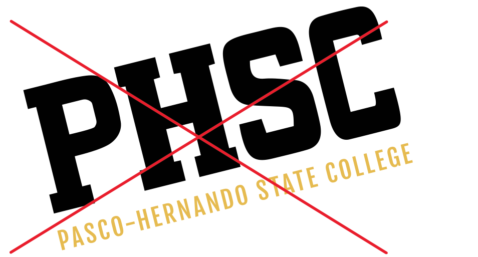
Consistency is key when establishing and maintaining the integrity of a brand. Do not make modifications to any PHSC logo.
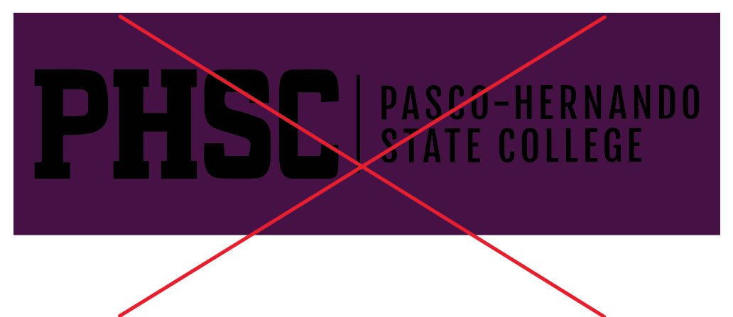
Do not change the color.
Do not separate the elements from one another.
Do not distort.
Do not use unapproved fonts.
Do not skew the elements.
Do not rotate the elements.
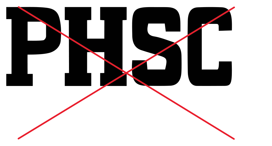
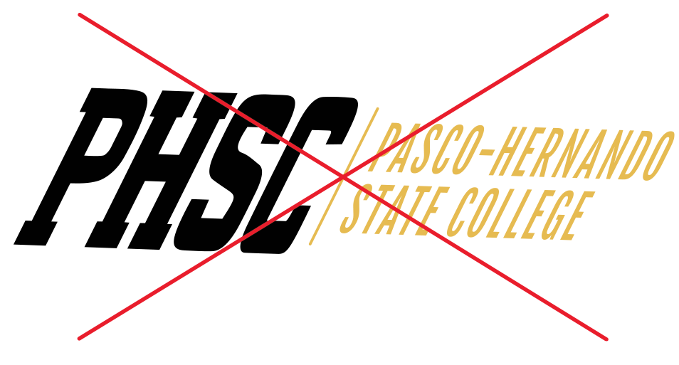
Do not use PHSC only.
Do not make the logo unreadable.
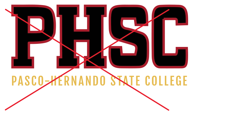
Do not stroke or outline.
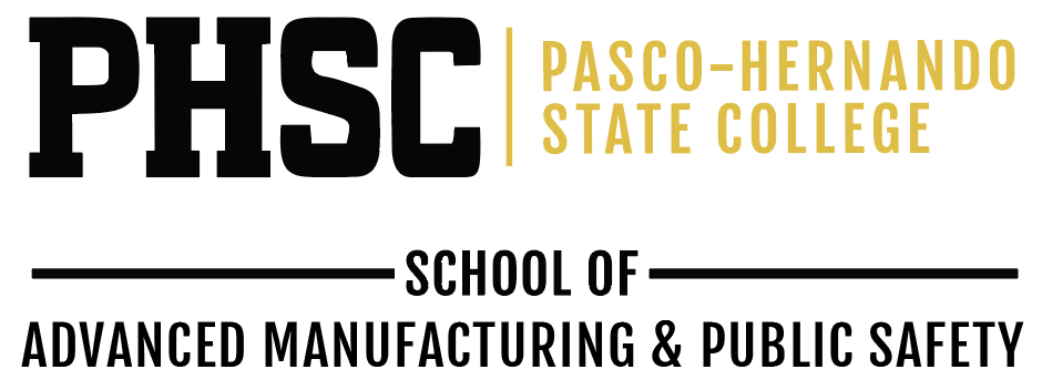
Logo Lock-Ups with Academic Schools
PHSC has created unit lock-ups for the academic schools to help students and potential students identify clear academic pathways from PHSC to four-year programs at colleges and universities. Unit lock-ups have limited usage applications.
In an effort to preserve brand unity, please do not create your own unit lock-up.


Our Brand
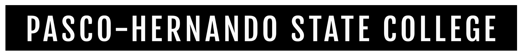
Header
Word mark PHSC header is to be used on all public facing promotional items. Placed at the very top of the image full width. i.e., flyers, mailers and print collateral.
Footer With Social Icons, Website and Disclaimer
All items displaying PHSC content must have the footer. To be used on any and all items displaying content of PHSC.

Footer Alternate
To be used on PHSC items where disclaimer is already listed (i.e. website) or when graphic space is limited.

Footers must be displayed in full width of the total asset area presented at the bottom of the layout.
Sub-Brand Logos
The President’s Leadership Institute, PHSC Alumni, and the Faculty Development Institute logos, are the only exceptions to the Master brand. There are no other sub-brand logos. Sub-brands create a disconnect from the main college brand.
Sub-brands should not be used without the Master logo. They are an extension of the brand—not a replacement. If space is limited, only the Master logo is used.
The standard minimum clear space of 12 the height should also be maintained.