Logo
Logo
College Logo
The Pasco-Hernando State College logo is the primary graphic identity for the institution. As the emblem for the entire PHSC community, great care should be given to correctly use the master logo. Our logo is one of our most important assets. Consistent treatment is key to creating a clear understanding of who we are and what we stand for.
It is a combination of the monogram and the College’s name or “signature” in two colors, in a fixed relationship that should not be altered or modified. The PHSC logo should appear in black and gold whenever possible only in the configurations presented here.
All departments/offices within the college, except for Athletics, Student Experience and Engagement, and the PHSC Foundation must use the official PHSC Master logo. Department logos are created in special circumstances with the approval of the Senior Director of Marketing and Communications and have limited use.
The logo must be on the front cover of all printed materials created for external (student and community) audiences. For internal (employee) audiences, the logo can be placed either on the front or back cover. For all official documents, logos must be at top left of page.
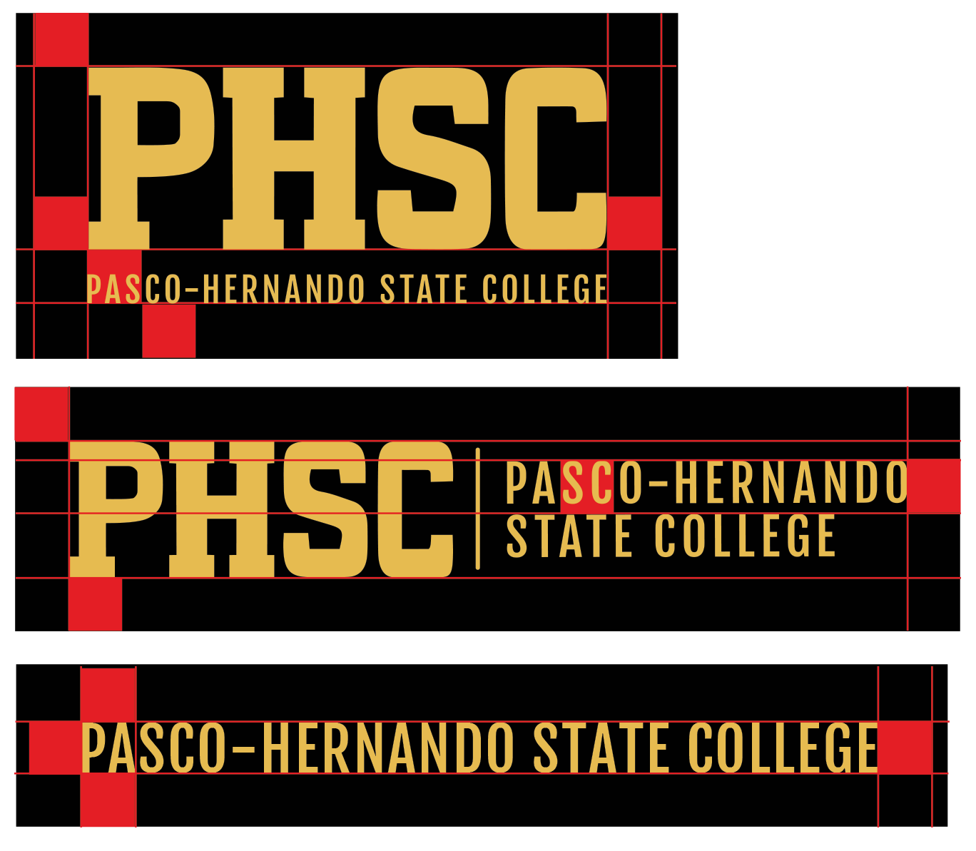
Clear Space
Clear space isolates the logo from competing elements—such as text and graphics. This preserves the integrity of the logo and ensures legibility prominence.
Always maintain the minimum clear space around the logo. The minimum clear space is based on a height of 0.5’’ on all four sides of the logo.
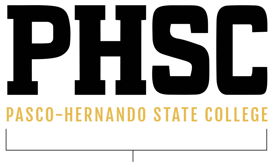
Stacked
Determined from the bottom of the PHSC text to the bottom of the Pasco-Hernando text. All four sides at the minimum.
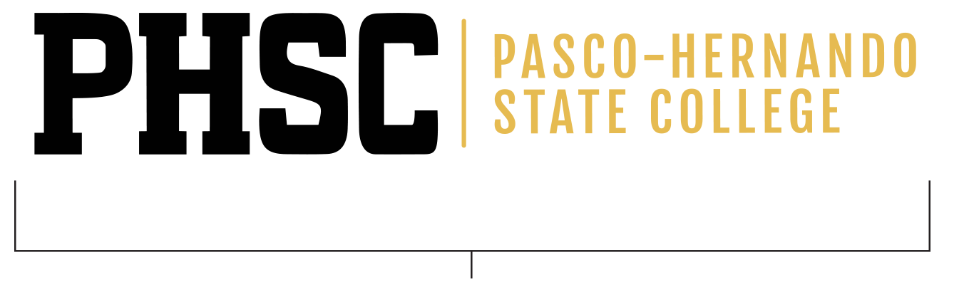
Horizontal
Determined From the height of the wording Pasco-Hernando to the top of the wording State College. All four sides at the minimum.
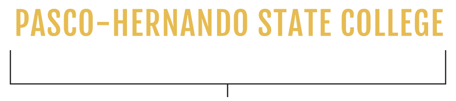
Horizontal Straight Text
Determined by the height of the text itself. All four sides at the minimum.
Approved Alternate Logos
In applications in which the preferred logo treatment does not present well, use an approved alternate logo. The approved clear space is 0.5” around all PHSC logos.
Scaling
The PHSC logo is a strong mark that can be scaled proportionally to a wide range of sizes. However, a logo that is too small, will be illegible and ineffective. The minimum size of a logo varies and depends on the version used. When scaled proportionally, the smallest sizes for the approved logos are as follows:
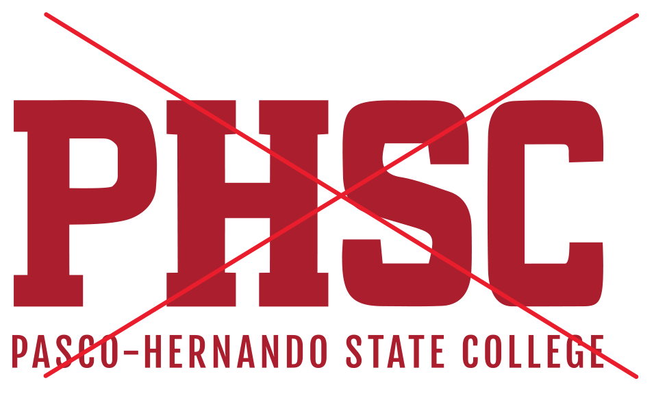
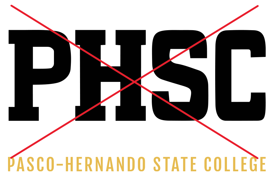
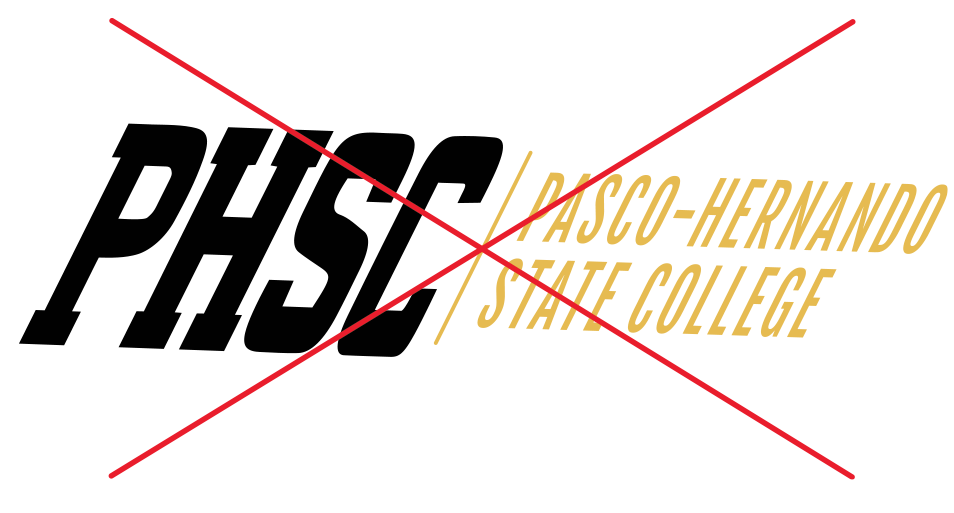
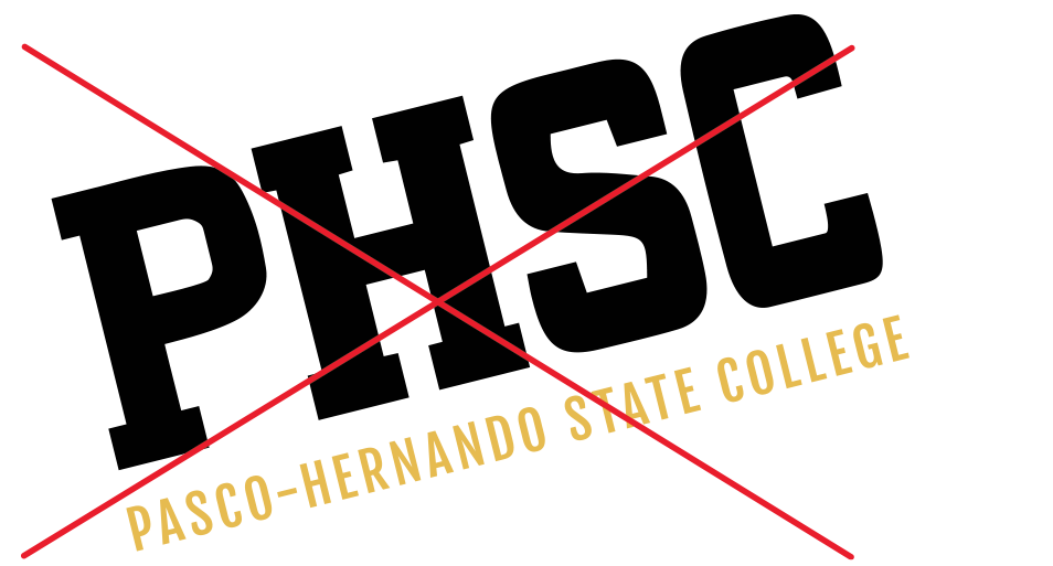
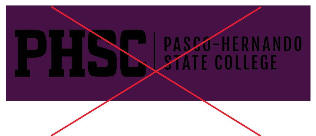
Master Logo—Improper Logo Treatments
Consistency is key when establishing and maintaining the integrity of a brand. Do not make modifications to any PHSC logo.
Do not change the color.
Do not separate the elements from one another.
Do not distort.
Do not use unapproved fonts.
Do not skew the elements.
Do not rotate the elements.
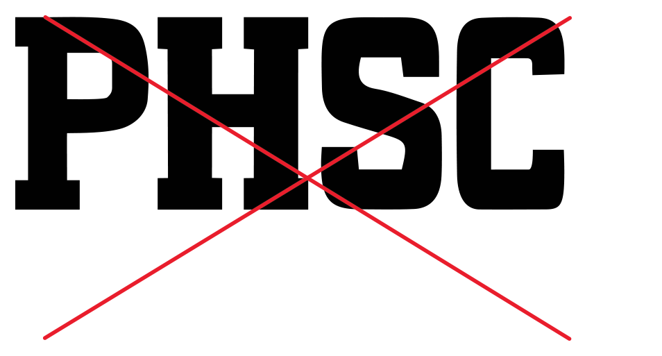
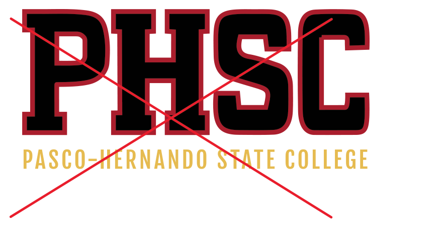
Do not use PHSC only.
Do not make the logo unreadable.
Do not stroke or outline.
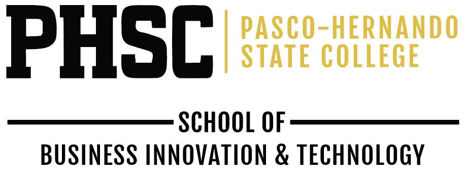
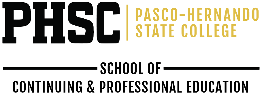
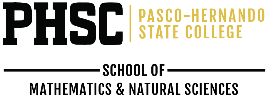
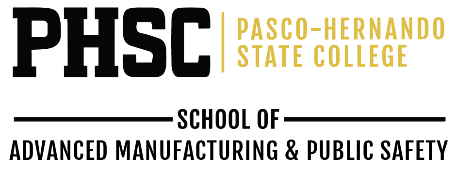
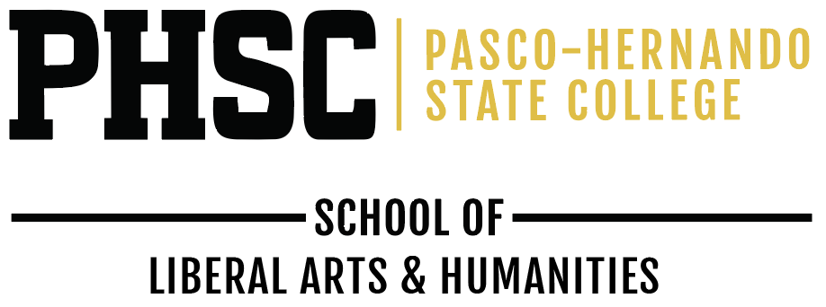
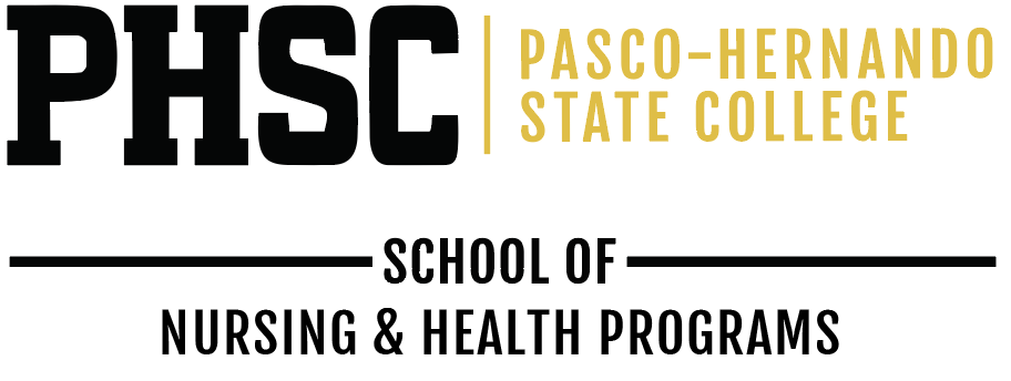
Logo Lock-Ups with Academic Schools
PHSC has created unit lock-ups for the academic schools to help students and potential students identify clear academic pathways from PHSC to four-year programs at colleges and universities. Unit lock-ups have limited usage applications.
In an effort to preserve brand unity, please do not create your own unit lock-up.
Our Brand
Header
Word mark PHSC header is to be used on all public facing promotional items. Placed at the very top of the image full width. i.e., flyers, mailers and print collateral.
Footer With Social Icons, Website and Disclaimer
All items displaying PHSC content must have the footer. To be used on any and all items displaying content of PHSC.
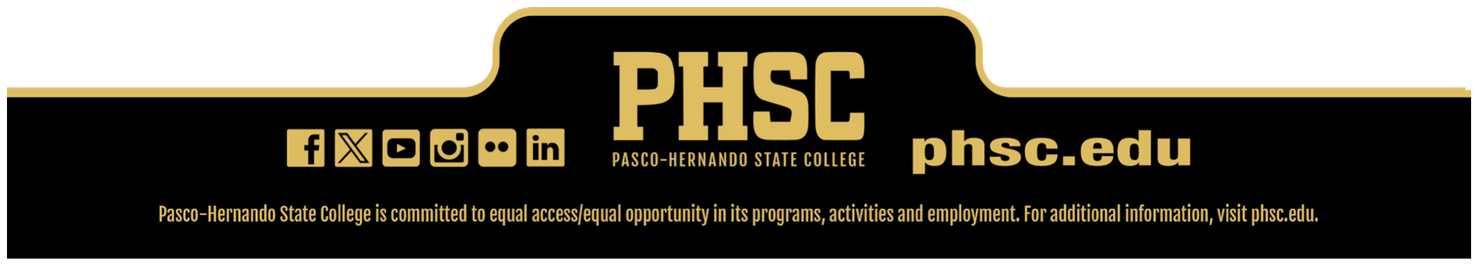
Footer Alternate
To be used on PHSC items where disclaimer is already listed (i.e. website) or when graphic space is limited.

Footers must be displayed in full width of the total asset area presented at the bottom of the layout.
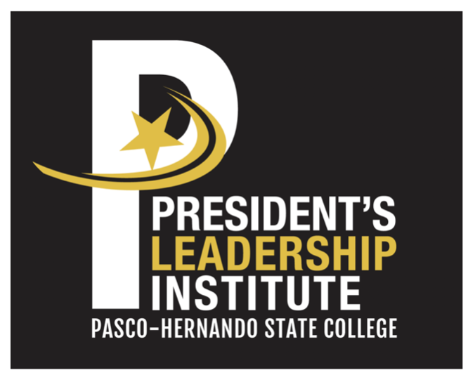
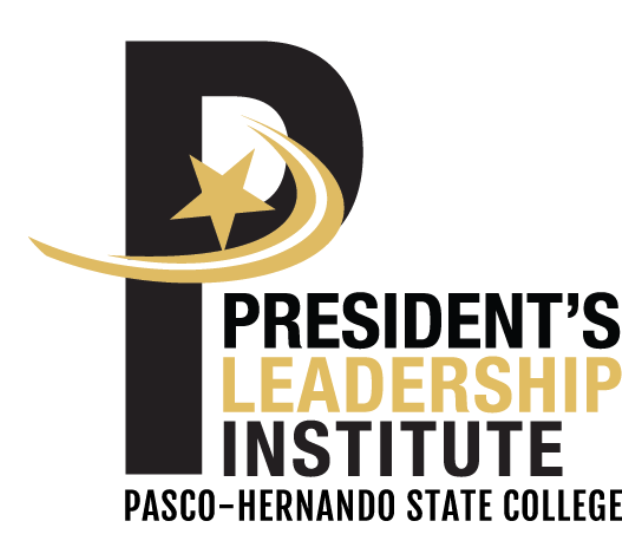
Sub-Brand Logos
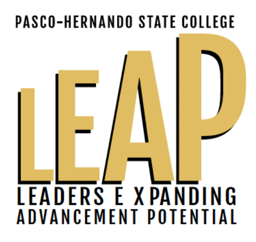
The President’s Leadership Institute, PHSC Alumni, and the Faculty Development Institute logos, are the only exceptions to the Master brand. There are no other sub-brand logos. Sub-brands create a disconnect from the main college brand.
Sub-brands should not be used without the Master logo. They are an extension of the brand—not a replacement. If space is limited, only the Master logo is used.
The standard minimum clear space of 12 the height should also be maintained.

College Seal
College Seal
Official College Seal
The college seal features the central image of a stately oak tree. The proud oak represents growth, beauty, wisdom, and the power of education. The roots of the oak run deep in our two-county district, signifying the College’s stable connection to the community. Branches represent the many disciplines of higher education, reaching for enlightenment. The oak’s leaves symbolize the cycle of education, an ageless process that spans time and provides opportunities for each new generation. The symbol of the oak tree, expressed in black and gold, is rimmed by the name of the College and anchored by the date of its establishment.

College Seal Guidelines and Usage
The most formal symbol of Pasco-Hernando State College is the seal. It is the official academic signature of the College. As such, the seal is reserved for use on formal documents or forms of the highest official rank and include:
- Communications from the Office of the President
- Official documents including diplomas and legal documents
- Official three-dimensional presentations including commencement medallions and podium displays
The College seal is not interchangeable with the College logo. The College seal should not be used on items such as promotional materials, general stationery, pins, business cards or most College signage.
In accordance with Board Rule 6Hx19-1.19, the seal may only be used with permission of the Office of Marketing and Communications or the President.
Colors
The college seal may be used in full color, black and white or the designated colors of the College. The college seal may be foil stamped in gold. Use only reproduction quality images of the seal (available from the Office of Marketing and Communications) for direct reproduction.
Black PMS Black, Gold PMS DS 9C-2, White.
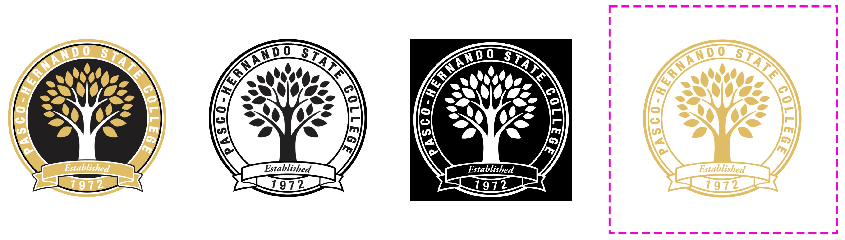
Clear Space
To give the seal the maximum amount of emphasis, a clear zone surrounding the seal must be maintained. This clear space size of a minimum of 1/8 the total height.
Scaling
The minimum size the seal can be printed measures 1.4375” square.
Program Emblem
Program Emblem
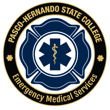
Program Emblem and patch
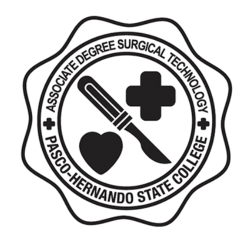
Program emblems are limited in usage and reserved for PHSC health and workforce academies—type treatment for uniform embroidery and imprint, and official invites and programs for a specific program and/or academy.
Program emblems and patches are not to be used in promotional materials.
Law Enforcement and Corrections
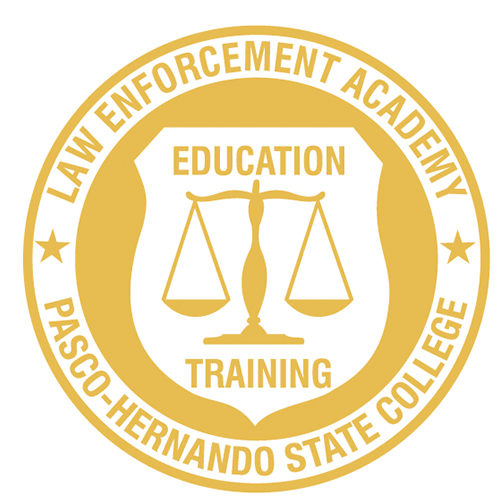
Minimum Size: 0.45’’ x 0.45’’
Clear Space: 0.5’’
Fire Science Technology
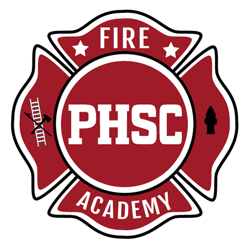
Minimum Size: 0.875’’ x 0.8809’’
Clear Space: 0.5’’
Unmanned Vehicles Systems Operation
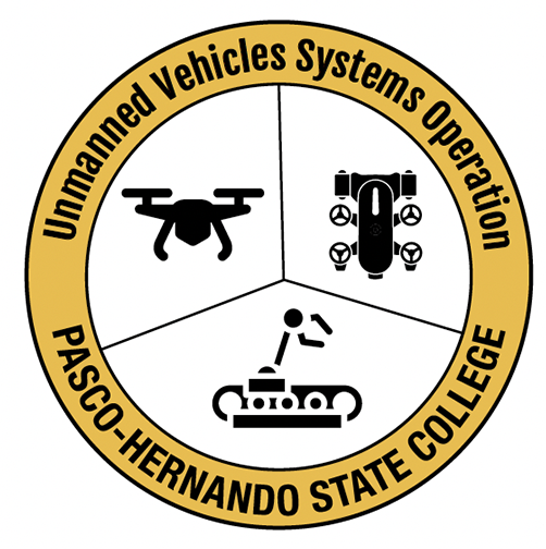
Minimum Size: 1.5’’ x 1.5’’
Clear Space: 0.5’’
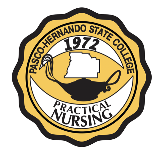
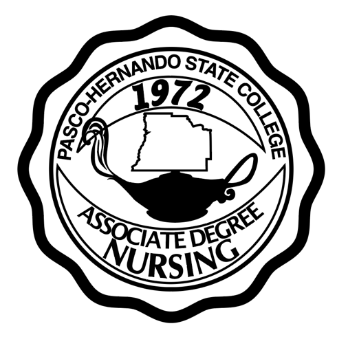
Nursing
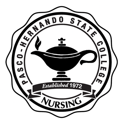
Minimum Size: 1’’ x 1’
Clear Space: 0.5’
Practical Nursing
Associate Degree Nursing
Surgical Technology
Aviation
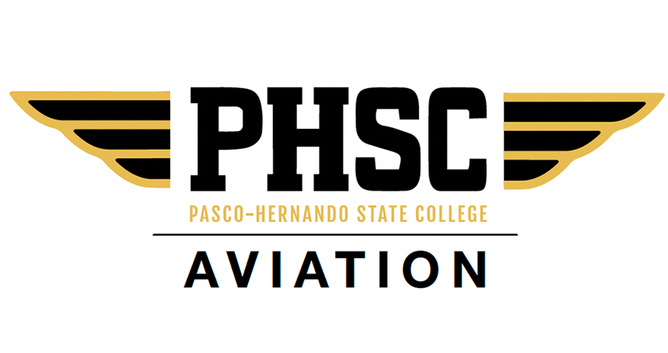
Minimum Size: 2’’ x 0.6015’
Clear Space: 0.5’
Emergency Medical Technician (EMT)
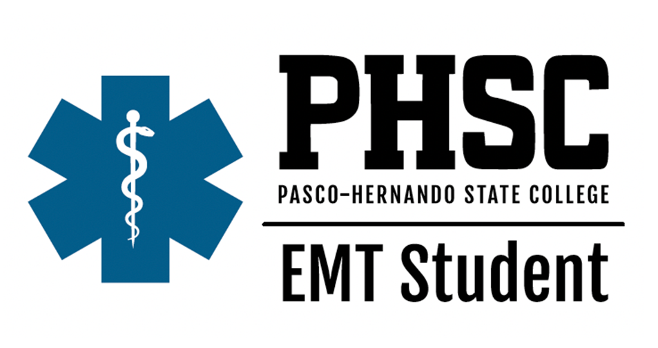
Minimum Size: 2.5’’ x 1.0342’’
Clear Space: 0.5 ’
EMT
Paramedic
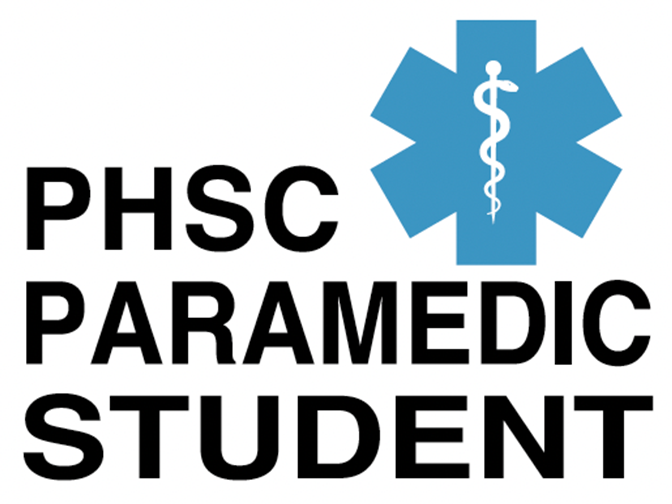
Minimum Size: 1.8’’ x 1.3159’’
Clear Space: 0.5 ’
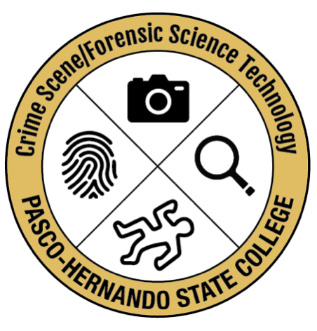
Crime Scene Forensic Tech
Spirit Brand
Spirit Brand
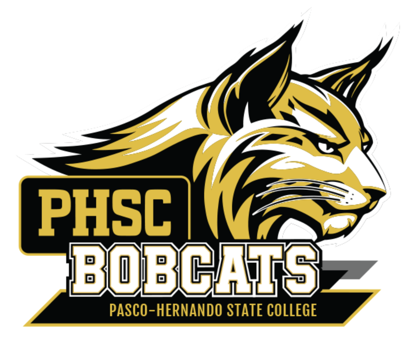
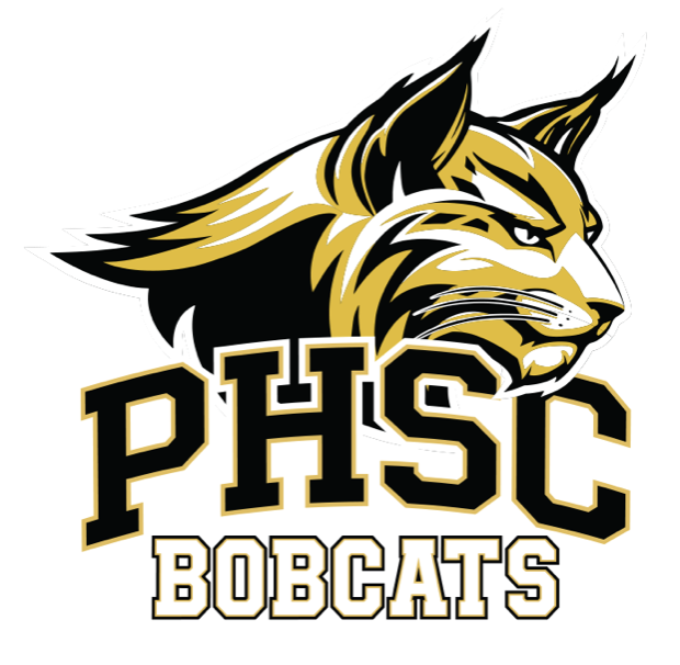
PHSC Spirit Brand
The PHSC Spirit logo is relatable to PHSC students, providing a sense of belonging and identity with the college. It conveys bold confidence, fearlessness and impressive courage—all characteristics that we value here at Pasco-Hernando State College. A solitary predator by nature, the bobcat represents a culture of persistence and adaptability in an ever-changing environment.
The PHSC spirit brand has traditionally been reserved for Athletics and Student Life, where it has played a key role in fostering bobcat pride and student engagement. As PHSC continues to grow and evolve, we recognize that school spirit extends beyond competition and co-curricular activities—it is also reflected in the programs, academic schools and initiatives that support our students and community every day.
To that end, PHSC is expanding access to the spirit brand to selected groups on a limited, case-by-case basis. This expanded use is intended to celebrate bobcat pride while maintaining the integrity, consistency and visual impact of the spirit brand.
Master Palette
Color is one of the most important elements of PHSC’s brand identity. It’s important that the master color palette remains consistent across printed materials and electronic formats. Color specifications are given in Pantone (PMS), CMYK, and RGB values to accommodate a range of technical and media considerations. Secondary support palette remains the same.
PHSC Spirit Gold

CMYK: 10/25/80/0
RBG: 229/187/80
WEB: e6bb52
PHSC Black

CMYK: 0/0/0/100
RGB: 0/0/0
WEB: 000000
PHSC White
RGB: 255/255/255
WEB: FFFFFF
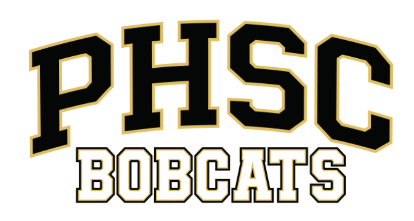
PHSC Spirit Logos
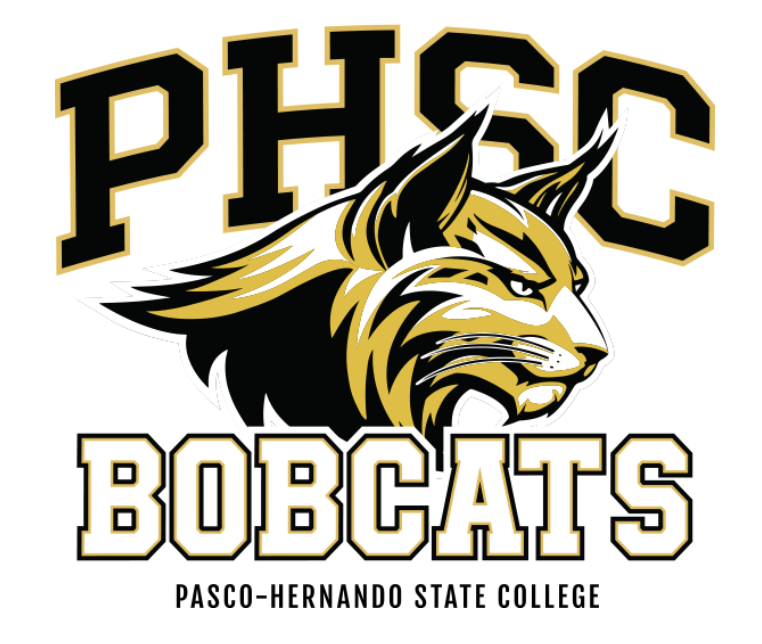
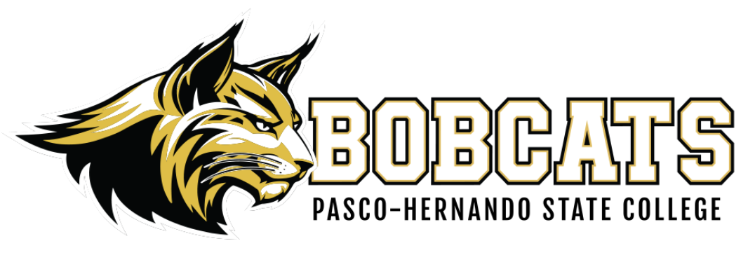

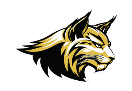
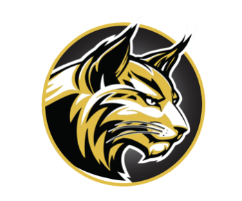
The PHSC Bobcat Head and Round Bobcat Head logos must be accompanied with our Wordmark logo per asset.
NOTE: The minimum clear space of ALL logos is based on 1/3 the height of the logo on all four sides.
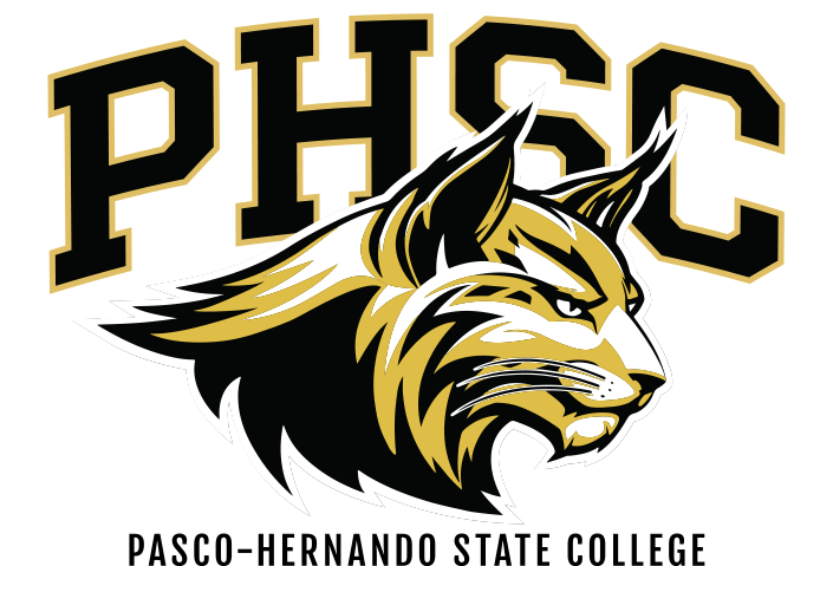
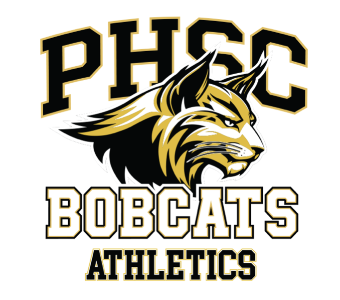
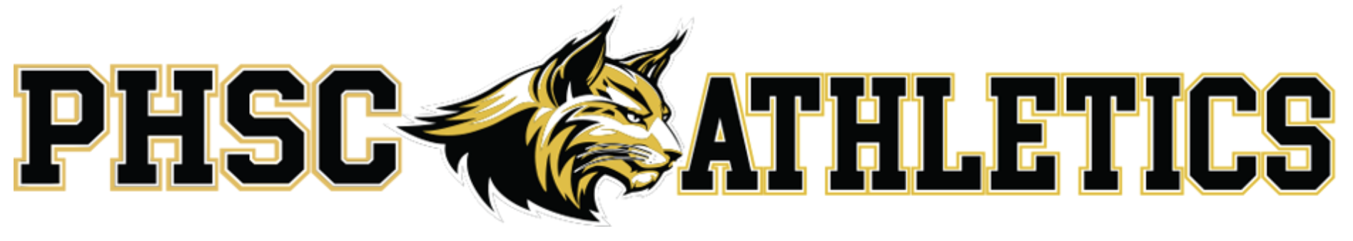
PHSC Spirit Logo (For Athletics Only)
These PHSC logos are for use by Athletics ONLY. They can be used on PHSC promotional items, with the permission of PHSC Office of Marketing and Communications.
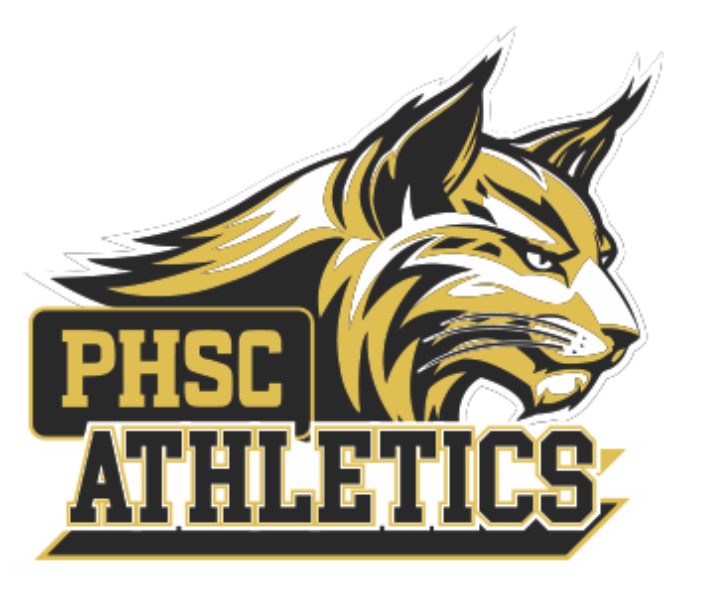
NOTE: The minimum clear space of ALL logos is based on 1/3 the height of the logo on all four sides.
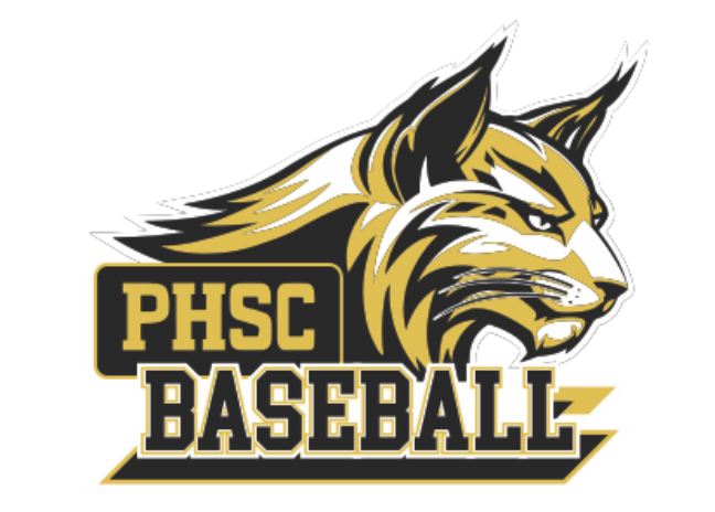
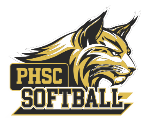
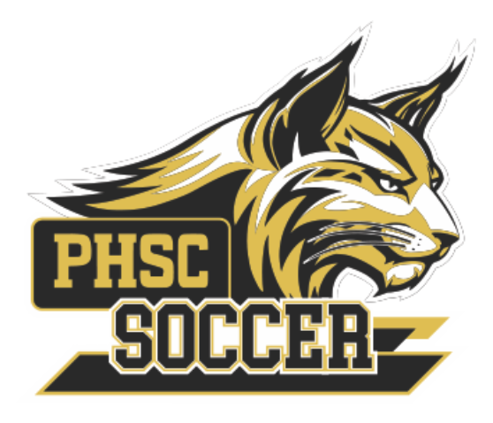
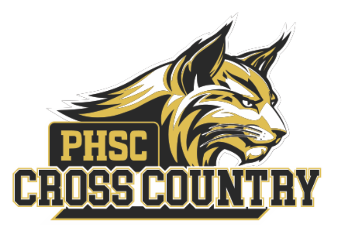
PHSC Spirit Logos (Sport Specific—For Athletic Use Only)
These PHSC logos are for use by Athletics ONLY. They can be used on PHSC promotional items, with the permission of PHSC Office of Marketing and Communications.
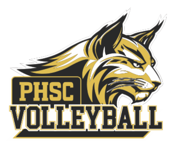
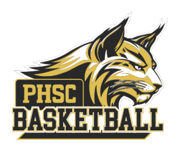
NOTE: The minimum clear space of ALL logos is based on 1/3 the height of the logo on all four sides.