Identity
Identity
Welcome to the PHSC Brand Center!
Constant transformation defines Pasco-Hernando State College (PHSC). What started as a college without walls in 1972 has become an award-winning state college powerhouse with five full-service campuses and a state-of-the-art instructional performing arts center.
In the past decade, we’ve been recognized by prestigious educational organizations, secured competitive workforce grants, and collaborated with industry partners. We’ve seen record-breaking participation in our first-ever comprehensive fundraising campaign that allows us to help more students achieve their educational goals through scholarship funding. Our professors are recognized in their respective fields and attract the highest caliber students.
The way we present the College should reflect our strength as we progress as leaders and innovators in higher education.
We developed this brand guide to help you encapsulate the voice and tone of our ever-evolving college—an academic institution with six locations, more than 85 programs of study, and nearly 500 dedicated faculty and staff—a place to collaborate, discover, and forge a future in which to be proud.
Our programs and centers have individual identities and missions but there is a common spirit of ingenuity, optimism, and commitment. When we communicate—whether through print, digital, or social media—we should present ourselves with a strong, unified voice—a voice describing an institution that is authentic, encouraging, innovative, caring, progressive, engaging, and global. One that knows the future has endless potential.
Sincerely,
The Office of Marketing and Communications
Brand
Brand
You Are the Brand
Our brand is our culture, principles, reputation, and the stories we tell to influence opinions. We all deliver a brand experience to our community through our interactions with others, through customer service, advertising, marketing, public relations, and our visual identity. By sharing information and stories about the College with our community, and being consistent with our messaging, we encourage quick recognition and build our reputation.
Key Components of Our Brand
The PHSC Brand Promise
PHSC will inspire engagement and motivate students to reach their potential through affordable and quality higher education programs.
Brand Personality
- Authentic
- Caring
- Encouraging
- Engaging
- Innovative
- Optimistic
- Progressive
Guiding Philosophy
Pasco-Hernando State College believes in the power of education. Committed to an open-door policy, the College supports the pursuit of knowledge and provides accessible and affordable opportunities for all students to reach academic and career goals.
The College embraces diversity and values the contributions of our students, faculty and staff, and the unique communities within our district. Embracing a student-centered environment lies at the heart of our mission.
Through continuous assessment, self-evaluation, and improvement, PHSC encourages the participation of the College community in the development of a shared vision.
We believe all students, faculty, staff, district residents and community leaders, through meaningful discourse, can make significant contributions toward the attainment of PHSC’s goals and the future advancement of the College.
Clubs and Organizations
Clubs and Organizations
Student-Run Clubs and Organizations
All student club and organizations materials are to be created by the club or organizations under the guidance of Student Life and Leadership.
Students may:
- Use “PHSC” in the names of their clubs and organizations
- Use PHSC’s black and gold colors and secondary colors in the logos
- Design custom marks for their clubs and organizations
Students may not:
- Use any of PHSC’s official logos
- Create a social media account without the approval of the Office of Marketing and Communications
- Add art elements to any PHSC logo
- Use PHSC logo on personal business cards (Business cards are used to identify faculty or staff of the College)
Social Media Policy
Social Media Account Creation
All official PHSC social media accounts/pages and any/all other platforms using the PHSC moniker, name, logo, spirit logo, or any variation of said name or logo(s), are the responsibility of the Office of Marketing and Communications working with the assistance and guidance of Institutional Technology.
Below are the steps for student club/organization social media account creation:
-
New student club/organization social media account requests must be submitted for approval, approved by the appropriate Student Life staff, with a request processed through a Marketing request, found on PHSC's Intranet.
-
The Senior Director of Marketing and Communication will decide whether a club or organization shall be granted an official college affiliated social media account based on current best practices, potential for regular use and intended purpose.
-
The PHSC seal, logo, or spirit logo may not be used by any social media account that is not Included in PHSC’s official social media account family.
-
Upon approval of requested account(s), profile pictures and cover photos shall be submitted to the Graphic Designer for approval via the Marketing Request accessible on PHSC's Intranet.
-
Initial account managers, nominated by department heads, are subject to approval by the Office of Marketing and Communications.
Responsibility for Social Media Content
The student club/organization that initiates the creation of a social media account has the continuing and primary responsibility for ensuring the content published on their social media pages is current, accurate and complies with the publishing standards developed by the Office of Marketing and Communications.
The Office of Marketing and Communications may review and revised published social media account and direct the account manager to publish the revised content or if necessary remove, or make edits to, any social post/content not in compliance with the PHSC brand and standards.
Promotional Materials
To receive promotional materials for student clubs and organizations, please get in touch with the Student Life and Leadership department. The Office of Marketing and Communications does not supply promotional materials for clubs and organizations.
Official Materials
Official Materials
Official College Marketing Materials
Official Marketing materials for the college are to be created by the Office of Marketing and Communications. This is including any items that are public facing or distributed into the community.
Colors
Colors
Color Palette
Master Palette
We are black and gold! We use white as needed to emphasize those two colors.
Our logo should only be displayed in our master colors. In contrast to it’s counter part color. Gold logo on black is preferred. A piece of visual collateral should be made up of 50% in total of black or gold, and 25% of it’s counter part for a total of 75%. The counterpart of the main chosen color should be the headline and body copy can include white. Color is one of the most important elements of PHSC’s brand identity. It’s important that the PHSC Master Color Palette remains consistent across printed materials and electronic formats. Master Color specifications are given in Pantone (PMS), CMYK, RGB and web values to accommodate a range of technical and media considerations.
Black
RGB: 0/0/0
CMYK: 75/68/67/90
HEX: #000000
PANTONE: Black C
Gold
RGB: 230/187/0
CMYK: 11/24/100/0
HEX: #e6bb00
PANTONE: 7406 C

White
RGB: 255/255/255
CMYK: 0/0/0/0
HEX: #ffffff
Preferably only to be used in print cases limited to black and white or product merchandise printing.

Secondary Support Palette
The purpose of the Secondary Color Palette is to offer flexibility to balance the need for consistency while building brand recognition. The secondary palette must be used in support of the Master Palette, not in place of it. The are not to be used as a background fill or total coverage. They are limited to 2 colors x 10% of the total visual area for an asset of a total of 20%. Our logo is not allowed to appear in these colors. White text should be used on these colors. The purpose of the Secondary Color Palette is to offer flexibility to balance the need for consistency while building brand recognition. The secondary palette must be used in support of the Master Color Palette, not in place of it. Color specifications are given in, CMYK, RGB and web values to accommodate a range of technical and media considerations
Blue
RGB: 59/115/185
CMYK: 80/53/0/0
HEX: #3b73b9

Green
RGB: 0/111/70
CMYK: 89/32/87/22
HEX: #006f46

Smoky Blue
RGB: 61/66/98
CMYK: 82/76/38/25
HEX: #3d4262

Gray
RGB: 112/112/112
CMYK: 57/48/48/15
HEX: #707070

Accent Colors
We use these to draw attention to and/or accentuate an item of interest Example may be a stroke on a button saying “Apply Today!” These colors should not be used as body copy or headline text. Combined or individually these should not be used more than 5% of the visible area of an asset. Color specifications are given in, CMYK, RGB and web values to accommodate a range of technical and media considerations.
Purple
RGB: 129/0/127
CMYK: 60/100/14/3
HEX: #81007f

Sharp Teal
RGB: 0/255/204
CMYK: 55/0/38/0
HEX: #00ffcc

Color Palette Breakdowns
Incorrect usage compromises the integrity of the brand. Based on the Color Bridge Coated—The Plus Series Pantone Book values.
Fonts
Fonts
PHSC Brand Fonts
Standard-Heavy
Standard-Heavy should be used sparingly since it has a bold composition. The best place to use this font would be in a header or title.

Fjalla One
Our signature font is Fjalla One. Fjalla One is a slimmer more modern font. The best place to use this font would be the subhead/call out/footer/disclaimer.

Arial Regular
The best place to use Arial Regular would be the body copy.

Additional use of Arial to accent items of interest within body copy:

If you have additional questions or needs, please feel free to reach out to the Marketing Department.
PHSC Athletic Fonts
College Block
College Block is used as a main font for Athletics.

Lobster 1.4
Lobster 1.4 is used as a secondary font for Athletics.

Also including use of all Master Brand Fonts.
NOTE: Lobster 4.1 is Reserved for Baseball & Softball use only, and May need to be adjusted to NOT appear as cursive.
Logo
Logo
College Logo
The Pasco-Hernando State College logo is the primary graphic identity for the institution. As the emblem for the entire PHSC community, great care should be given to correctly use the master logo. Our logo is one of our most important assets. Consistent treatment is key to creating a clear understanding of who we are and what we stand for.
It is a combination of the monogram and the College’s name or “signature” in two colors, in a fixed relationship that should not be altered or modified. The PHSC logo should appear in black and gold whenever possible only in the configurations presented here.
All departments/offices within the college, except for Athletics, Student Life and Leadership, and the PHSC Foundation must use the official PHSC Master logo. Department logos are created in special circumstances with the approval of the Senior Director of Marketing and Communications and have limited use.




The logo must be on the front cover of all printed materials created for external (student and community) audiences. For internal (employee) audiences, the logo can be placed either on the front or back cover. For all official documents, logos must be at top left of page.
Clear Space
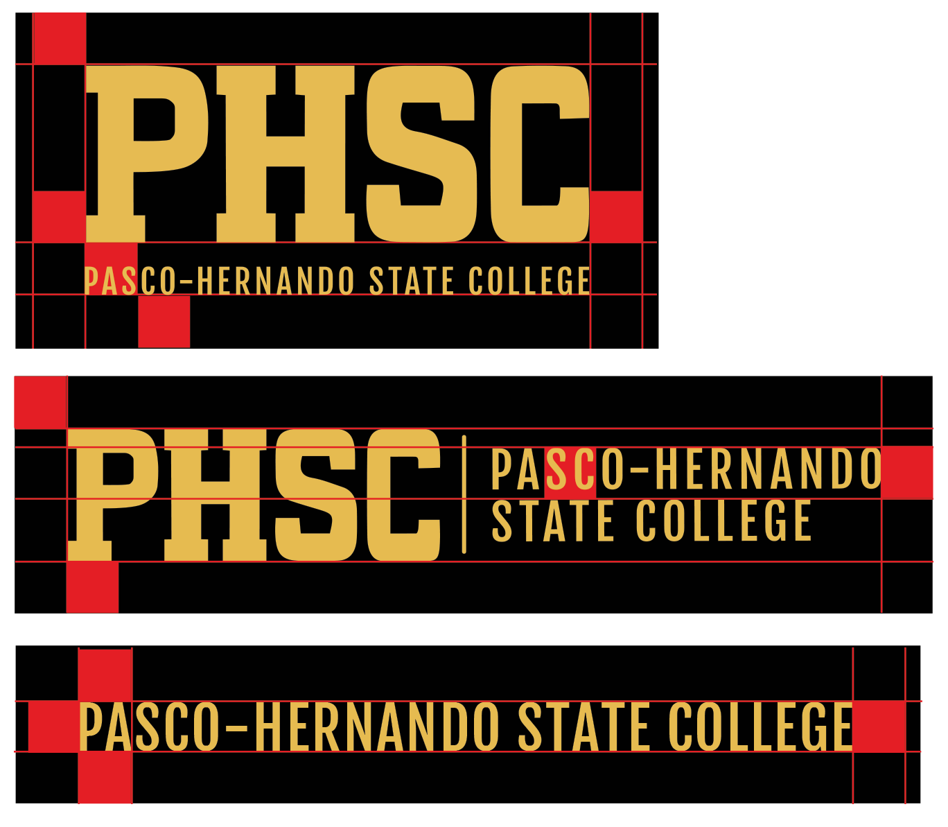
Clear space isolates the logo from competing elements—such as text and graphics. This preserves the integrity of the logo and ensures legibility prominence.
Always maintain the minimum clear space around the logo. The minimum clear space is based on a height of 0.5’’ on all four sides of the logo.
Stacked
Determined from the bottom of the PHSC text to the bottom of the Pasco-Hernando text. All four sides at the minimum.
Horizontal
Determined From the height of the wording Pasco-Hernando to the top of the wording State College. All four sides at the minimum.
Horizontal Straight Text
Determined by the height of the text itself. All four sides at the minimum.
Approved Alternate Logos
In applications in which the preferred logo treatment does not present well, use an approved alternate logo. The approved clear space is 0.5” around all PHSC logos.
Scaling
The PHSC logo is a strong mark that can be scaled proportionally to a wide range of sizes. However, a logo that is too small, will be illegible and ineffective. The minimum size of a logo varies and depends on the version used. When scaled proportionally, the smallest sizes for the approved logos are as follows:


Master Logo—Improper Logo Treatments
Consistency is key when establishing and maintaining the integrity of a brand. Do not make modifications to any PHSC logo.
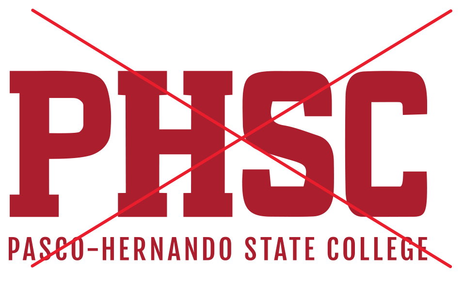
Do not change the color.
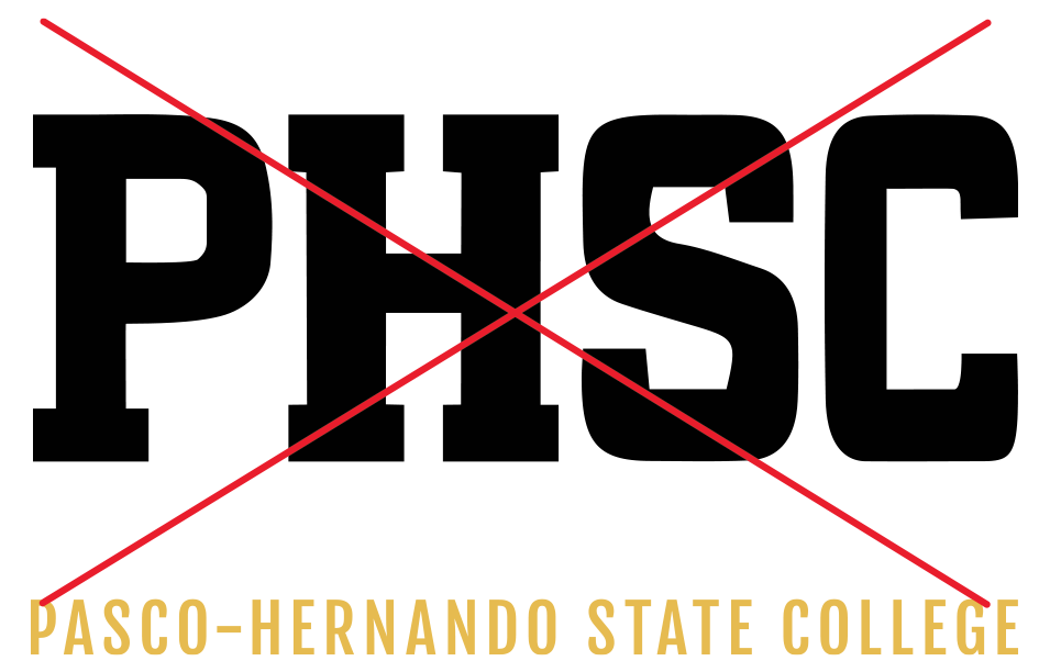
Do not separate the elements from one another.
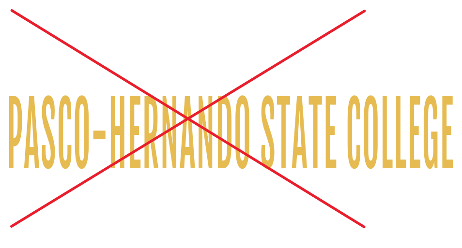
Do not distort.
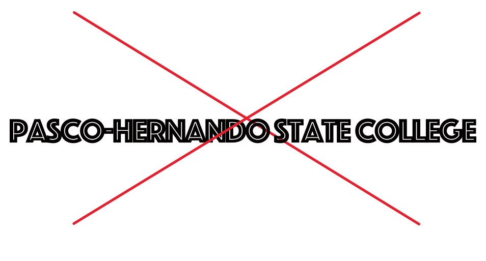
Do not use unapproved fonts.
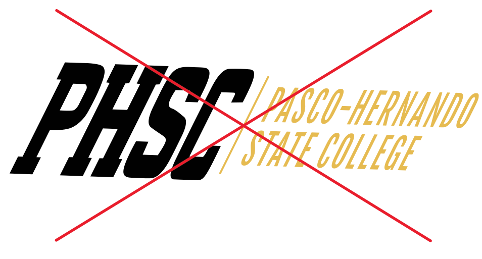
Do not skew the elements.
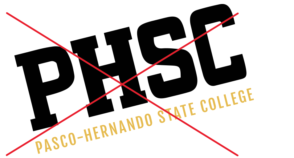
Do not rotate the elements.

Do not use PHSC only.
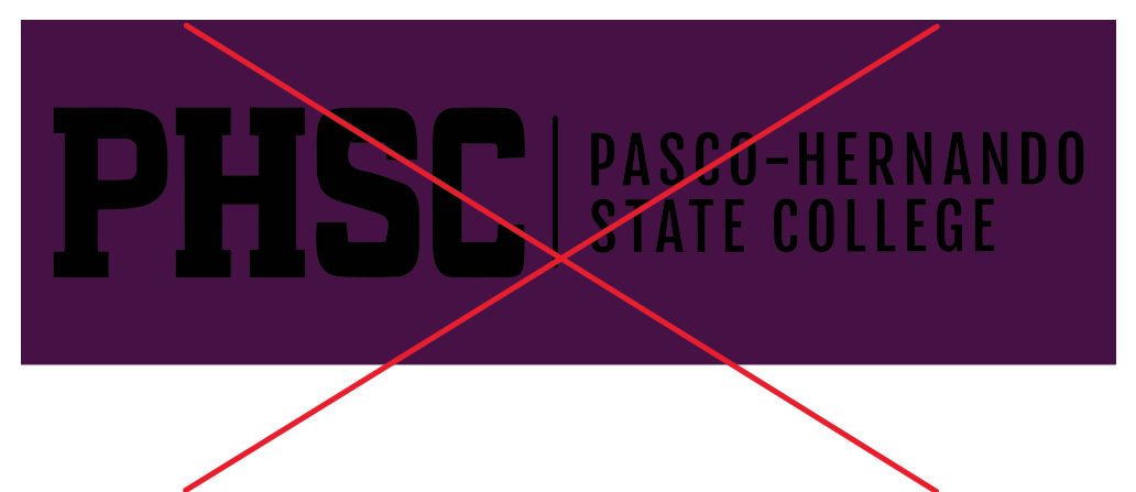
Do not make the logo unreadable.
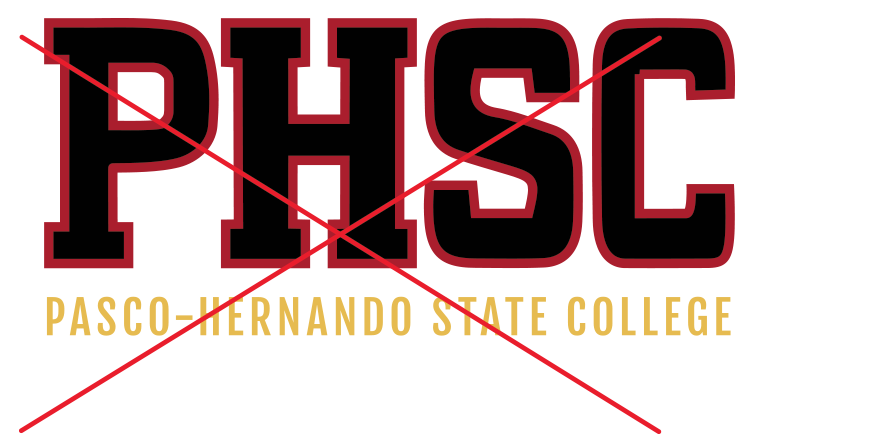
Do not stroke or outline.
Logo Lock-Ups with Academic Schools
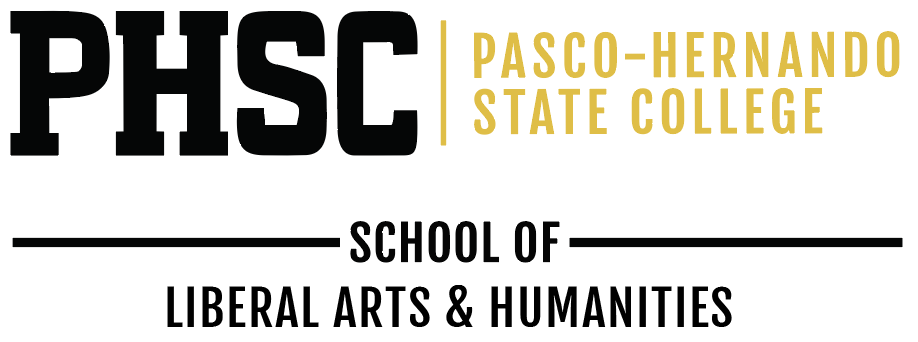
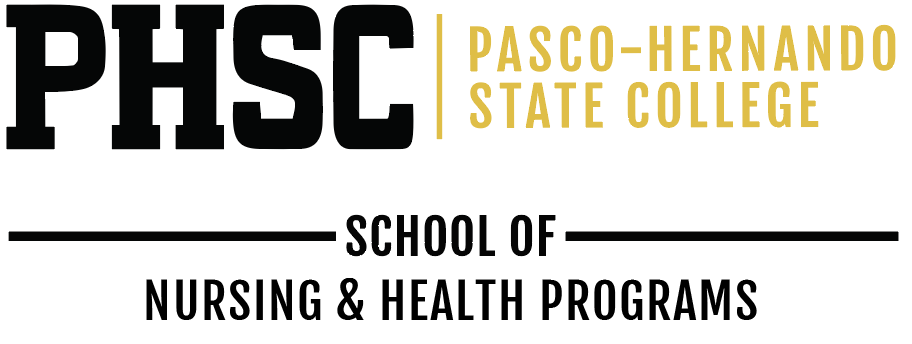
PHSC has created unit lock-ups for the academic schools to help students and potential students identify clear academic pathways from PHSC to four-year programs at colleges and universities. Unit lock-ups have limited usage applications.
In an effort to preserve brand unity, please do not create your own unit lock-up.




Our Brand
Header
Word mark PHSC header is to be used on all public facing promotional items. Placed at the very top of the image full width. i.e., flyers, mailers and print collateral.

Footer With Social Icons, Website and Disclaimer
All items displaying PHSC content must have the footer. To be used on any and all items displaying content of PHSC.

Footer Alternate
To be used on PHSC items where disclaimer is already listed (i.e. website) or when graphic space is limited.

Footers must be displayed in full width of the total asset area presented at the bottom of the layout.
Sub-Brand Logos
The President’s Leadership Institute, PHSC Alumni, and the Faculty Development Institute logos, are the only exceptions to the Master brand. There are no other sub-brand logos. Sub-brands create a disconnect from the main college brand.
Sub-brands should not be used without the Master logo. They are an extension of the brand—not a replacement. If space is limited, only the Master logo is used.
The standard minimum clear space of 12 the height should also be maintained.


College Seal
College Seal
Official College Seal
The college seal features the central image of a stately oak tree. The proud oak represents growth, beauty, wisdom, and the power of education. The roots of the oak run deep in our two-county district, signifying the College’s stable connection to the community. Branches represent the many disciplines of higher education, reaching for enlightenment. The oak’s leaves symbolize the cycle of education, an ageless process that spans time and provides opportunities for each new generation. The symbol of the oak tree, expressed in black and gold, is rimmed by the name of the College and anchored by the date of its establishment.

College Seal Guidelines and Usage
The most formal symbol of Pasco-Hernando State College is the seal. It is the official academic signature of the College. As such, the seal is reserved for use on formal documents or forms of the highest official rank and include:
- Communications from the Office of the President
- Official documents including diplomas and legal documents
- Official three-dimensional presentations including commencement medallions and podium displays
The College seal is not interchangeable with the College logo. The College seal should not be used on items such as promotional materials, general stationery, pins, business cards or most College signage.
In accordance with Board Rule 6Hx19-1.19, the seal may only be used with permission of the Office of Marketing and Communications or the President.
Colors
The college seal may be used in full color, black and white or the designated colors of the College. The college seal may be foil stamped in gold. Use only reproduction quality images of the seal (available from the Office of Marketing and Communications) for direct reproduction.
Black PMS Black, Gold PMS DS 9C-2, White.

Clear Space
To give the seal the maximum amount of emphasis, a clear zone surrounding the seal must be maintained. This clear space size of a minimum of 1/8 the total height.
Scaling
The minimum size the seal can be printed measures 1.4375” square.
Program Emblem
Program Emblem
Program Emblem and patch
Program emblems are limited in usage and reserved for PHSC health and workforce academies—type treatment for uniform embroidery and imprint, and official invites and programs for a specific program and/or academy.
Program emblems and patches are not to be used in promotional materials.
Law Enforcement and Corrections

Minimum Size: 0.45’’ x 0.45’’
Clear Space: 0.5’’
Fire Science Technology

Minimum Size: 0.875’’ x 0.8809’’
Clear Space: 0.5’’
Unmanned Vehicles Systems Operation

Minimum Size: 1.5’’ x 1.5’’
Clear Space: 0.5’’
Nursing
Minimum Size: 1’’ x 1’
Clear Space: 0.5’
Practical Nursing
Associate Degree Nursing

Surgical Technology

Aviation

Minimum Size: 2’’ x 0.6015’
Clear Space: 0.5’
Emergency Medical Technician (EMT)

Minimum Size: 2.5’’ x 1.0342’’
Clear Space: 0.5 ’
EMT

Paramedic

Minimum Size: 1.8’’ x 1.3159’’
Clear Space: 0.5 ’
Crime Scene Forensic Tech

Spirit Brand
Spirit Brand
PHSC Spirit Brand
The PHSC Spirit logo is relatable to PHSC students, providing a sense of belonging and identity with the college. It conveys bold confidence, fearlessness and impressive courage—all characteristics that we value here at Pasco-Hernando State College. A solitary predator by nature, the bobcat represents a culture of persistence and adaptability in an ever-changing environment.
The PHSC spirit brand has traditionally been reserved for Athletics and Student Life, where it has played a key role in fostering bobcat pride and student engagement. As PHSC continues to grow and evolve, we recognize that school spirit extends beyond competition and co-curricular activities—it is also reflected in the programs, academic schools and initiatives that support our students and community every day.
To that end, PHSC is expanding access to the spirit brand to selected groups on a limited, case-by-case basis. This expanded use is intended to celebrate bobcat pride while maintaining the integrity, consistency and visual impact of the spirit brand.
Master Palette
Color is one of the most important elements of PHSC’s brand identity. It’s important that the master color palette remains consistent across printed materials and electronic formats. Color specifications are given in Pantone (PMS), CMYK, and RGB values to accommodate a range of technical and media considerations. Secondary support palette remains the same.
PHSC Spirit Gold

CMYK: 10/25/80/0
RBG: 229/187/80
WEB: e6bb52
PHSC Black

CMYK: 0/0/0/100
RGB: 0/0/0
WEB: 000000
PHSC White

RGB: 255/255/255
WEB: FFFFFF
PHSC Spirit Logos



The PHSC Bobcat Head and Round Bobcat Head logos must be accompanied with our Wordmark logo per asset.
NOTE: The minimum clear space of ALL logos is based on 1/3 the height of the logo on all four sides.
PHSC Spirit Logo (For Athletics Only)
These PHSC logos are for use by Athletics ONLY. They can be used on PHSC promotional items, with the permission of PHSC Office of Marketing and Communications.
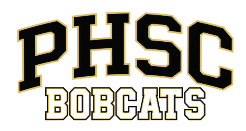

NOTE: The minimum clear space of ALL logos is based on 1/3 the height of the logo on all four sides.
PHSC Spirit Logos (Sport Specific—For Athletic Use Only)
These PHSC logos are for use by Athletics ONLY. They can be used on PHSC promotional items, with the permission of PHSC Office of Marketing and Communications.

NOTE: The minimum clear space of ALL logos is based on 1/3 the height of the logo on all four sides.
Style Guide
Style Guide
PHSC Style Guide
This Pasco-Hernando State College writing style guide is designed to create consistency—in text and graphic design—throughout all PHSC communications, both print and electronic. The goal is to create a consistent, positive image of the College to multiple audiences and to reinforce the brand of the institution.
Editorial Style
Editorial Style
The Office of Marketing and Communications uses the Associated Press Stylebook as a guide for all written copy. This guide includes some basic AP styles for commonly used words and abbreviations, style issues related to academia and for words and phrases unique to PHSC. The full version of the PHSC Style Guide can be found in the Marketing and Communications section of the Intranet.
Business correspondence, PowerPoint presentations, publications, emails, or any communication created on behalf of the College should be written in a style that is simple, collegial, and clearly stated. Presenting a consistent style of communication when addressing students, colleagues and the community reinforces the fact that we represent the College. It is important to use the style guide which supports the institution voice.
- Follow the guidelines of the Associated Press
- Avoid jargon—use simple, clear language that the reader would quickly recognize.
- Define acronyms on the first reference.
- Be brief—whenever possible, keep to the message you want to convey.
- Always provide contact information, URL (phsc.edu), and social icons if applicable
- To ensure accuracy, have someone proofread your work before sending it out.
If a writing or editorial question is not addressed below or in the full version guide, please contact the Office of Marketing and Communications at marketing@phsc.edu.
